Wednesday, January 23, 2013

Messing with Ink: Ningauble

So I've been meaning for a while now to play around with ink again, and last night I had a bit of extra time so started up this small drawing. I wasn't sure where to start since I haven't really used ink since school, but I had an extra piece of clay board lying around so I started with a quick pencil sketch on that. Then, I went in with a brush for the larger black areas, and detailed it out with Micron pen in some areas and scratched away with an x-acto (SO much better than those crap scratchboard nibs I had in school). I had a lot of fun messing around on this and I hope to continue to play with it in the future. The character is Ningauble of the Seven Eyes from the stories of Fafhrd and the Gray Mouser. 

5"x7" ink on clayboard

Thursday, January 17, 2013

Princess of the Underworld Advanced

Last week I shared a new painting I had done for the app game Legend of the Cryptids. This week I'm sharing the second "advanced" version of the Princess of the Underworld

 In this version the princess went from being a more sympathetic non-threatening character to more powerful and intimidating. Her beloved skull from the "normal" version is also now incorporated into her staff, and she's brought all of hell to the fight. I definitely had a great time working on this one.
12"x16" Oil on illustration board
I'd also like to thank the AD, Misako, she was really a joy to work with. I think some American companies could take a cue from the Japanese. They really treat artists with respect and professionalism. 

Friday, January 11, 2013

Princess of the Underworld

It seems strange that lately I've been doing more and more work, and yet, I have less and less that I can share with you. 

Well, I guess something is better than nothing. 
I've just been informed that I can share some art I did for digital "card game" app, Legend of the Cryptids. Creating card art for a digital app game is somewhat of a new a thing lately, with quite a few similar games popping up over the past year or two. The idea of the game is that you collect various character cards through "quests" where you pit your characters against the computers, and earn rewards by defeating various levels of monsters and bosses. Now the interesting part for me as an artist is that each card is able to be evolved by combining two of the same character. Thus, it requires two pieces of art that start as a "normal" version of a character and somehow upgrade into an awesomer "advanced" version once it is evolved. I'll talk a little more about the evolution process in my next post.

But for now, lets talk about the "normal" version. Princess of the Underworld is her card name, but instead of having her be all dark and evil (which is probably where I would've went) they wanted her to be a bit more sympathetic. So outside of that, they didn't give much in the way of scene or character design direction, which was nice for a change. Anyway, here's what she ended up looking like.
12"x16" Oil on panel, digital additions
Next up, I'll share how she evolved in the "advanced" version. 

Tuesday, November 27, 2012

Paizo: Inner Sea Bestiary

Well, it's been forever since I've updated the blog here. Between freelance projects, school, Illuxcon, and holiday travels i've not had a spare moment to write anything up lately. Not to mention all the things i've done that are still under wraps, but! at long last I have some new things I can share with all of you. 
This past year I've had the pleasure of working with Paizo on some of their characters. I like doing characters because they're fun, and I get to focus on just the figure. It's a breath of fresh air not having to think about a background sometimes. Andrew Vallas was the AD for this project and he was a joy to work with. Check out the Inner Sea Bestiary here. All of these  are painted in oils on illustration board.

Lashunta- She's a sorceress who's race is know best for their tiny antennae on the forehead.

Noqual Golem- When I painted this, he was supposed to be made of glass, but I think in the book he's now made of metal. I still like to think of him as glass.

 Lorthact- Ex duke of hell. Painting dudes with hooves is always fun.

 Ghoran- Now, this was was a weird one. A race of people made out of plants who's face is surrounded by a cowl and made up of colored flower petals. Her stomach also needed to have patterning and coloration of a watermelon and a sort of orifice for a belly button. 

 Petrified Maiden- A female fighter turned to stone...at least on the outside. 

 Nightripper- And last but not least, this guy is my favorite of the bunch. A perfect combination of weird, creepy, and awesome. Nothing like a blood soaked jackal-legged albino demon to get the party started.

All images © Paizo Publishing 2012

Thursday, September 27, 2012

Dragon 415: The Ghost Caravan

Hello everyone, it's been a while since i've posted on here...but what else is new? Things have been busy as usual around here. I've got quite a few things waiting in the wings that I can hopefully show soon. My girlfriend and I also took a little vacation to Norway two weeks ago. Maybe I'll get a post in about that in the coming days, but for now here's a new one I did not too long ago for an article in this month's Dragon Magazine. The article tells of a mysterious caravan that has been sighted on many occasions, and is believed to be ghosts, but is actually just a bunch of smugglers who travel in secrecy for the king.
8x18" Oil on illustration board

Thursday, August 23, 2012

New Painting: Riding Hood

So I've finally managed to get settled back in after a great time at GenCon. I'm trying desperately to get back on track with my commissions, but in the mean time, here's a 
new-ish painting I finished up just before leaving last week. It's a twist on Red Riding Hood. Well, I guess the only thing that ties it to the story is that he's wearing a red hooded cape.

16"x22" Oil on board


I've also added it to my etsy page since it seemed that lots of people were interested in prints at GenCon. So go pick one up here!

Tuesday, August 14, 2012

Off to GenCon 2012

I'm heading off to GenCon today as some may know. This will be my second time with a booth at the convention and i'm very excited. This year is also especially exciting/nerve wracking because I will also be one of the judges for the art show. The reason being due to the fact that I won "Best in Show" last year and one of the stipulations of said award is that the winner has to judge the following year. I'm nervous! Mostly because I know there will be tons of great art there as always, and I have no idea how i'm going to narrow my choices down. We'll see how it goes. My co-judges will also be the very talented and famous, Todd Lockwood, and super awesome art director, Jon Shindehette

A few months ago I was also asked if I would do some sketches on a dice bag for a charity auction. I figured this would be a fun thing to do for a good cause so of course I agreed. Here's my dice bag that will be up for auction:


If you're planning to attend come stop by my booth and say hi!

Tuesday, August 7, 2012

General V

Here's something a little different I did not too long ago for Scholastic. An evil British general burning the White House in 1814. The gnarly scar was definitely my favorite part.
10x15" Oil on illustration board


Wednesday, August 1, 2012

Grad School Bootcamp: Week Two!

Last week I spoke about my first of the two week contact period for the Low Residency MFA in Illustration program. And today I'll go on a bit about week two. 


After week one finished on friday we essentially reset again and start off the following week with new classes and lectures. It's a bit more relaxed than week one also because we didn't have the business of illustration class at both 7:30am and 6:30pm.
What we did have though, was still quite a challenge: Create a fully roughed out children's book dummy in just 4 days from scratch.


We did come to class with our story ideas already figured out, but I'm not much of a children's book writer. So to save myself the headache I decided to stick with a classic. I chose Jack and the Beanstalk. Now, I think the original story of Jack and the Beanstalk could use a little tweaking, but with my time constraints I had to keep to the task of creating images.
I did, however have two ideas that would make it a bit different from most other versions of the classic tale. 


First, I decided that I would like to give the story a bit more of an orientalist flair. Mostly because I like the design elements of orientalist art and I can also pull loosely on my experiences in Egypt to help inform certain things. Second, I would like the format of the book to open vertically. This would give me tall spreads that would help push the perspectives and size relationships for things like the height of the beanstalk, the size of the giant and his house, etc...


So off to thumbnails I went...but there was a problem. The week prior I was pummeled with the idea of doing 50 thumbnails for every 1 idea. But I only had 6 ideas to flesh out last week. Now I have between 14-20 full spreads, and less days to do them in. It wasn't going to work so I had to make the best of it. I started a sheet with measured thumbnails in photoshop and just started drawing. It looked like this:


After getting a bunch of ideas down I began picking the ones I would like to develop for each spread. You can see in the right column where I've stared filling spreads with thumbnails from the left. After that was settled, I started fleshing out my thumbnails in photoshop for the rough dummy. Usually at this point I would have shot reference and everything, but there was no time for that....which I think was good in some cases, and maybe a little rough in other cases. Whatever the deal was, I think it was good for me to have to rely on stuff from my head rather than photos immediately.


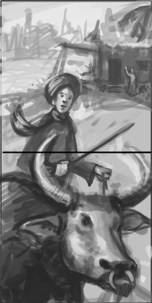
So here's a few of the spreads:


In the end, the book ended up being 48 pages which came out to about 20 spreads. These were a lot of fun to flesh out and I think the book as a whole came out well...considering it was done in 4 days. 

Thursday, July 26, 2012

Back from Illustration Grad School Bootcamp: Week 1

Two weeks ago I set off for Hartford, CT to begin an intense two week contact period for the Low Residency MFA in Illustration program that I am enrolled in. What is a Low Residency MFA in Illustration program? Well, it's a graduate program designed for working professionals that allows one to earn an MFA in a timely manner without the need to relocate or put jobs/life on hold. Check out details here if you wish to learn more.


Today I'm going to focus on our first week of class in the program. The main assignment for the week was the "Dream Assignment" -or- come up with absolutely anything you'd ever want to illustrate....For someone who's used to, and prefers constraints, not an easy task.


After several days of flip flopping around about what I would possibly want to do as the ONE thing. I finally settled on a series of short stories that I had read some time ago and have stuck in my mind ever since. Ill Met in Lankhmar. I compilation of stories written by Fritz Leiber chronicling the adventures of Fafhrd and The Grey Mouser. I've always found the stories and characters to be interesting for their quirkiness. They aren't simply brutes running around destroying everything in their paths (though that's cool too), but they are human and make mistakes and poor decisions, and get into trouble, but they stick it out as comrades no matter what. Anyway, without getting into their whole back story and why I like them, lets talk about the process of said class.


So day one we show up to class and are promptly told to present our ideas. This is both nerve-wracking and exciting for the reasons that it's been a while since i've been in the classroom environment and i'm feeling terribly unsure about my level of preparedness (it was low). 
Soon after presenting our ideas and proving why our idea was a good one (I suppose I convinced them enough) things got a little easier...at least on the not-knowing-what-the-hell-to-expect level. 


Our task was to take whatever ideas and sketches we came to class with and elaborate on them. By elaborate, I mean we had to do 50 new thumbnails for every 1 of our six initial images. So 300 thumbnails. And 50 thumbnails of one idea from someone who usually finds it a stretch to do 10 was definitely a learning experience. For the sake of all of you, I've just taken a photo of all my thumbnail pages laid out on my floor.

I think it was a great process to completely break all of our pre-made boundaries that we've set for ourselves. I know for myself, thumbnailing has always been a difficult part of any project. Mostly because I think too technically about the given idea to let myself be free and go with whatever comes to mind. This has definitely helped to make that process much smoother and less painful. It was also surprising to see how many thumbnails I would choose for refining well after the 20 thumbnail mark. I think one idea even came at thumbnail #50...Definitely an eye-opener for one accustomed to marrying the first idea I throw down.

If I haven't mentioned it before, we had to create six comp sketches by the end of the week. 
After narrowing down my tiny images and picking one for each idea here's the thumbnails  I chose: 


Each one serves as an illustration for a different short story. In retrospect, I think as I move forward with this project I would like to focus a series of images based just on one story. But for the sake of our time and the project I did these. And here's how my rough comps of each turned out: 


These were all done in photoshop for the sake of time and ease. I think the main focus for all of these and for me is that I want to try and create work that has a bit more feeling to it. I'm trying to subdue the colors to unify the images a bit more. Obviously these are just quick comps and will need a lot of work, but I hope to bring a few if not all of them to finish over the next several months. 

Next up: Week Two!